The new left sidebar consolidates all navigation functions in one place. This creates more space in the middle of your screen for the actual content.
What has changed?
Functions that were previously scattered across the screen are now consolidated in the sidebar. The overview below shows the main changes (the colors refer to the image below):
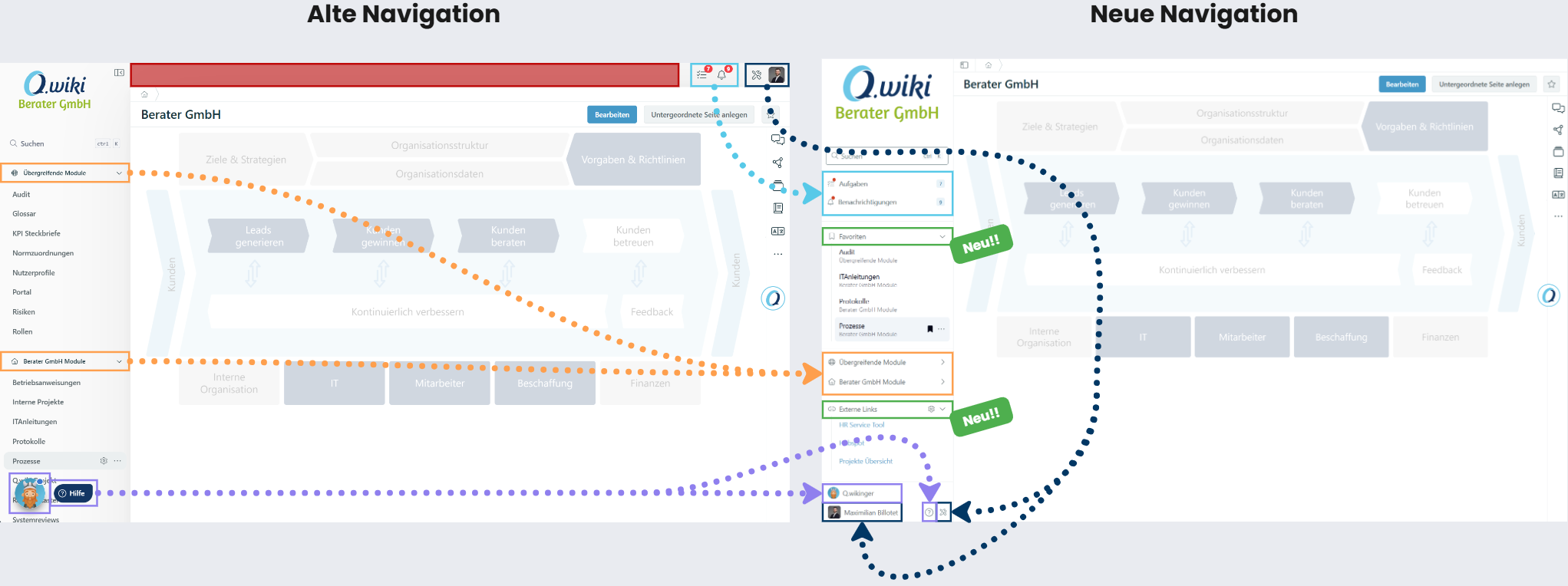
| Area (Color) | Change |
|---|---|
| Red | More space for page content through the more compact navigation. |
| Black | Personal settings and system tools have moved from the top right to the bottom of the sidebar. |
| Purple | The Q.wikinger and help area are integrated into the sidebar and no longer obscure content. |
| Blue | Notifications and tasks have moved from the top right to the top of the sidebar so you can process them faster. |
| Orange | Module groups are retained but can now be collapsed – with the new favorites feature, you can pin your most important modules at the top. |
| Green | New features: Users can pin favorites prominently in the sidebar. Key Users can additionally configure external links in the sidebar. |
Related Articles
Was this article helpful?
That’s Great!
Thank you for your feedback
Sorry! We couldn't be helpful
Thank you for your feedback
Feedback sent
We appreciate your effort and will try to fix the article